Xamarin Forms Custom Controls 1

Code reuse is essential for scalable development, and when it comes to composing a UI it is common build discrete components. Xamarin Forms approaches this with "Custom Controls" which I'll be exploring in a series of posts, starting here. I'll be starting off with the core concepts (as I understand them) and primitives, and increase complexity later on as more and more of the fundamentals are covered.
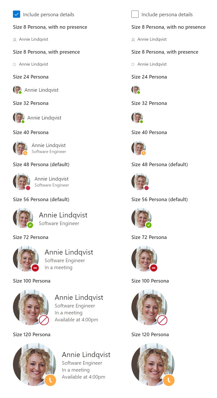
I find it helps to have a clear end-goal, to that end I'll be rebuilding Microsoft's Fluent UI web Persona component using the XAML-first approach. (Why XAML-first? Because it is used considerably more than the code-first approach. The code first approach will receive the same attention later in the series).
Software evolves over time, so its worthwhile documenting the versions used. Updates will be mentioned in later posts as they are integrated.
- Common
- Xamarin.Forms
4.8.0.1451 (4.8.0.1451+372-sha.54a167945-azdo.4064655)
- Xamarin.Forms
- Standard Library
- NETStandard.Library
2.0.3 - Xamarin.Essentials
1.5.3.2
- NETStandard.Library
- iOS
- XCode 12.1 (via Mac connected to from Visual Studio 2019 for Windows)
- Android
- Target Version/Compile Target: Android 10.0 (API Level 29 - Q)
- Min version: Android 5.0 (API Level 21 - Lollipop)
- UWP
- Target version: Windows 10, version 2004 (10.0; Build 19041)
- Min version: Windows 10, version 1809 (10.0; Build 17763)
- Microsoft.NETCore.UniversalWindowsPlatform
6.2.10
The ContentView Class
When building a control (XAML-first and code-first) you'll be extending Xamarin.Forms.ContentView or one of its child classes (e.g. Xamarin.Forms.CollectionView). Xamarin.Forms.ContentPage, the class used for constructing many pages is a child of ContentView meaning a page is itself a valid control.
Controls built with ContentView with XAML are typically consist of;
A XAML file where all or most of the UI is declared. Aside from providing separation of concerns, IDEs are able to use for enhanced UI building functionality.
While XAML is here used for UI composition its general function is to provide an alternative building an object structure. Particularly where Xamarin Forms is concerned, the objects you are using are little more than handlers for OS specific renderers.
<!-- **/ExampleControl.xaml -->
<?xml version="1.0" encoding="utf-8" ?>
<ContentView
    xmlns="http://xamarin.com/schemas/2014/forms"
    xmlns:x="http://schemas.microsoft.com/winfx/2009/xaml"
    x:Class="ProjectRootNamespace.ExampleControl"
>
    <!-- Control Content -->
</ContentView>
A C# class file typically referred to as "code behind". Interactivity is typically implemented here if the MVVM pattern is not being used (MVVM will be introduced later so as to keep focus in the right areas).
Note that InitializeComponent() is called in the constructor. This is responsible to loading the object structure defined in the linked XAML file.
Also note that the class is declared as partial. This allows code to be generated that helps the XAML and C# code to work together, and provides the aforementioned InitializeComponent() method.
// **/ExampleControl.xaml.cs
using Xamarin.Forms;
using Xamarin.Forms.Xaml;

namespace ProjectRootNamespace
{
    [XamlCompilation(XamlCompilationOptions.Compile)]
    public partial class ExampleControl : ContentView
    {
        public ExampleControl()
        {
            InitializeComponent();
        }
    }
}
A generated C# class file, whose purpose is mentioned above. It has been formatted and normalised for readability here, expect the actual code to be messier.
using System.CodeDom.Compiler;
using Xamarin.Forms;
using Xamarin.Forms.Xaml;
using Xamarin.Forms.Xaml.Extensions;

[assembly: XamlResourceIdAttribute("ProjectRootNamespace.ExampleControl.xaml", "**/ExampleControl.xaml", typeof(ExampleControl))]

namespace ProjectRootNamespace
{
    [XamlFilePathAttribute("ExampleControl.xaml")]
    public partial class ExampleControl : ContentView
    {
        [GeneratedCodeAttribute("Xamarin.Forms.Build.Tasks.XamlG", "2.0.0.0")]
        private void InitializeComponent()
        {
            LoadFromXaml(this, typeof(ExampleControl));
        }
    }
}
The Scope
For a project to run to run well, scoping is important. Lets take a closer look at the Persona component and see what we have to work with.
While simple enough in its purpose, there is a lot going on in the Persona control;
- Different sizes with content variations between sizes
- Optional "presence" indicator with multiple possible states
- Optional persona details presentation
- Various multi-purpose text fields
- Image fallback value of user initials (not shown)
Its... A lot. Certainly doable, but not all at once.
So we'll start simple, only implementing the name logic in this first post.
For those who might benefit, here is an example showing how the Persona React component is used.
import * as React from "react";
import { Persona, PersonaSize, PersonaPresence } from "office-ui-fabric-react/lib/Persona";

export function PersonaDemo() {
    return (
        <Persona
            imageUrl="https://example.com/persona-female.png"
            // This is a fallback for when the image is loading, or there is no image
            imageInitials="AL"
            text="Annie Lindqvist"
            secondaryText="Software Engineer"
            tertiaryText="In a meeting"
            optionalText="Available at 4:00pm"
            size={PersonaSize.size48}
            presence={PersonaPresence.online}
        />
    );
}
1 - Getting Started
First up we need to get the project setup. Nothing of particular interest here, its just something we have to do so I'll just be providing the bare minimum here.
- Create a new project from the "Mobile App (Xamarin.Forms)" template.
- Call the project "XamlFirstWithPersona".
- Enable "Place solution and project in the same directory"
- In the "New Mobile App" dialogue;
- Select the "Blank" app template.
- Select at least Android in the target options.
Specifics for other platforms/technologies will be covered in this series, but Android is the focus.
- Confirm projects can compile, deploy, and debug.
- Use git, make an initial commit.
Technically optional, but this will help debugging when things go wrong (since you can see what has changed).
2 - Alignment
Even with the blank app template, there will be some example content present. This varies across Visual Studio versions and updates, so update the MainPage.xaml file to resemble the following;
<!-- ./XamlFirstWithPersona/MainPage.xaml -->
<?xml version="1.0" encoding="utf-8" ?>
<ContentPage
    xmlns="http://xamarin.com/schemas/2014/forms"
    xmlns:x="http://schemas.microsoft.com/winfx/2009/xaml"
    x:Class="XamlFirstWithPersona.MainPage"
>
    <StackLayout Margin="30" HorizontalOptions="CenterAndExpand">
        <Label Text="Welcome to the main page!" />
    </StackLayout>
</ContentPage>
The styling we've applied is just to make the Persona control easier to see on all platforms (UWP adds debug helpers to the app UI).
3 - A New Control
Add a new ContentView XAML item called "Persona". It should look like the following;
<!-- ./XamlFirstWithPersona/Persona.xaml -->
<?xml version="1.0" encoding="UTF-8"?>
<ContentView
    xmlns="http://xamarin.com/schemas/2014/forms"
    xmlns:x="http://schemas.microsoft.com/winfx/2009/xaml"
    x:Class="XamlFirstWithPersona.Persona"
>
    <Label Text="Hello Xamarin.Forms!" />
</ContentView>
// ./XamlFirstWithPersona/Persona.xaml.cs
using Xamarin.Forms;
using Xamarin.Forms.Xaml;
namespace XamlFirstWithPersona
{
[XamlCompilation(XamlCompilationOptions.Compile)]
public partial class Persona : ContentView
{
public Persona()
{
InitializeComponent();
}
}
}As for using our shiny new control, its done like so;
<!-- ./XamlFirstWithPersona/MainPage.xaml -->
<?xml version="1.0" encoding="utf-8" ?>
<ContentPage
    xmlns="http://xamarin.com/schemas/2014/forms"
    xmlns:x="http://schemas.microsoft.com/winfx/2009/xaml"
    xmlns:app="clr-namespace:XamlFirstWithPersona"
    x:Class="XamlFirstWithPersona.MainPage"
>
    <StackLayout Margin="30" HorizontalOptions="CenterAndExpand">
        <Label Text="Welcome to the main page!" />
        <app:Persona />
    </StackLayout>
</ContentPage>
On running the app you should see "Hello Xamarin.Forms!", confirming the new control is being used.
4 - The Nature of the Beast
Without having added any business logic of our own, there are already some things we can do with our control. Try the following;
- Add
BackgroundColor="Red"to thePersonacontrol instance on./XamlFirstWithPersona/MainPage.xaml. - Add
BackgroundColor="Red"to theContentViewcontrol within./XamlFirstWithPersona/Persona.xaml. - Add
this.BackgroundColor = Color.Redto the constructor (afterInitializeComponent();) in./XamlFirstWithPersona/Persona.xaml.cs.
In terms of order of application, it goes;
- First the property in the XAML of the control.
- Then the property in the constructor of the control.
- Then finally the control instance property, which is applied last (and so "wins").
- Any code that changes the property after this will change the value as well. There is no "order of precedence" here like with CSS.
Provided you didn't have all these experiments in place at once; you should have noticed that not only do we have some fundamental functionality out of the box, but we can also use said functionality in a few places. There are some important learnings that can be drawn from this;
- The
ContentViewclass we build our control on top of provides some common functionality for us. - Since just about every control is built off of
ContentView, the same functionality ourPersonacontrol inherits is present in almost every control.
Almost as the way Xamarin Forms works means that while option may be physically present on the class, the outcome is dependent on platform specific renderers using it. Further, for some controls certain options may not make any sense, such asGestureRecognizer. - We need to be mindful of what we name our class properties to ensure we don't hide useful functionality.
- The root element
ContentViewin./XamlFirstWithPersona/Persona.xamleffectively refers tothis.
5 - Hello, my name is ...
Time to add the Name property! Modify the Persona XAML as follows;
<!-- ./XamlFirstWithPersona/Persona.xaml -->
<?xml version="1.0" encoding="UTF-8"?>
<ContentView
    xmlns="http://xamarin.com/schemas/2014/forms"
    xmlns:x="http://schemas.microsoft.com/winfx/2009/xaml"
    x:Class="XamlFirstWithPersona.Persona"
>
    <Label Text="Hello Xamarin.Forms!" />
    <Label x:Name="NameLabel" />
</ContentView>
And the code-behind;
// ./XamlFirstWithPersona/Persona.xaml.cs
using Xamarin.Forms;
using Xamarin.Forms.Xaml;

namespace XamlFirstWithPersona
{
    [XamlCompilation(XamlCompilationOptions.Compile)]
    public partial class Persona : ContentView
    {
        public Persona()
        {
            this.InitializeComponent();
        }

        public string Name
        {
            get
            {
                return this.NameLabel.Text;
            }
            set
            {
                this.NameLabel.Text = value;
            }
        }
    }
}
From here, all you need to do is set the Name property on the Persona control instance on ./XamlFirstWithPersona/MainPage.xaml.
6 - Design Time Preview
You may have noticed a "vertical split" option when viewing XAML such as ./XamlFirstWithPersona/Persona.xaml. Once activated the editor will split in 2, with a preview being shown. Small problem for Persona however, its preview is blank!
The cause is quite simple, it does not have any text to show in the preview. While we could define a default value by specifying a value for Text on the NameLabel, this would change the controls behaviour which may not be desired. There is a feature specific to design time that address this scenario, and it is used as follows;
<!-- ./XamlFirstWithPersona/Persona.xaml -->
<?xml version="1.0" encoding="UTF-8"?>
<ContentView
    xmlns="http://xamarin.com/schemas/2014/forms"
    xmlns:x="http://schemas.microsoft.com/winfx/2009/xaml"
    xmlns:d="http://xamarin.com/schemas/2014/forms/design"
    xmlns:mc="http://schemas.openxmlformats.org/markup-compatibility/2006"
    x:Class="XamlFirstWithPersona.Persona"
    mc:Ignorable="d"
>
    <StackLayout>
        <Label x:Name="NameLabel" />
        <Label x:Name="NameLabel" d:Text="Annie Lindqvist" />
    </StackLayout>
</ContentView>
Take another look at the preview, you should see design time specific text.
7 - Bindings
While what we have currently is nice and simple, its also inflexible (the how will make more sense later in the series) and is incompatible with bindings. Bindings are essential for productive development with the MVVM pattern, and usage of the advanced controls such as CollectionView. Without further ado, lets make the needed changes.
// ./XamlFirstWithPersona/Persona.xaml.cs
using Xamarin.Forms;
using Xamarin.Forms.Xaml;

namespace XamlFirstWithPersona
{
    [XamlCompilation(XamlCompilationOptions.Compile)]
    public partial class Persona : ContentView
    {
        public Persona()
        {
            this.InitializeComponent();
        }

        public string Name
        {
            get
            {
                return this.NameLabel.Text;
                return (string)this.GetValue(Persona.NameProperty);
            }
            set
            {
                this.NameLabel.Text = value;
                this.SetValue(Persona.NameProperty, value);
            }
        }

        public static readonly BindableProperty NameProperty = BindableProperty.Create(
            propertyName: nameof(Persona.Name),
            returnType: typeof(string),
            declaringType: typeof(Persona));

        protected override void OnPropertyChanged(string propertyName = null)
        {
           base.OnPropertyChanged(propertyName);

            if (propertyName == Persona.NameProperty.PropertyName)
            {
                this.NameLabel.Text = this.Name;
            }
        }
    }
}
The changes made have been a natural extension of the existing API surface.
NamePropertyhas a few responsibilities;- When a binding (e.g.
Name="{Binding FooBar}") is made, it targetsNamePropertyinstead ofName(hence it being public). - It acts as the value store.
- When a change is made,
OnPropertyChangedis invoked.
- When a binding (e.g.
Namenow effectively acts as an abstraction overNameProperty.OnPropertyChangedis responsible for seeing property changes reflected in the UI, which allows considerably more advanced logic to be implemented.
In Closing
With the absolute basics out of the way the next post will move at an overall faster pace, with more interesting changes. Until then!
